Introduction
The Interactive Hotspots app for Shopware 6 allows you to enrich a single photo with links to related products in your catalog, allowing your customers to see how well individual products compliment one other.

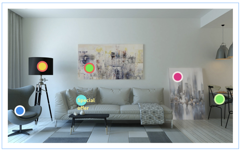
The above example of a modern living room sets an eye-catching scene that offers multiple products in the room for purchase. Customers searching for a new sofa (for example) will be inspired by such a scene, and much more likely to purchase additional complimentary products, based on the presentation.
Interactive Hotspots also provides a much more efficient method of shopping. Customers can visit entire shopping worlds and no longer have to browse through many related products and use their imagination to visualize them in context.
Interactive Hotspots is a highly customizable app, allowing external links to product descriptions, overview pages, social media profiles, or any other concievable web page, appealing mouseover effects and attractive overlays.
Simply upload your scene image, define your product hotspots and transform your store – all in a few clicks.
Pre-requisites
The app can only be installed on a self-managed Shopware environment running at least version 6.2.0.
Installation
Install the app in the usual way, via the Shopware “My extensions”.
| Unlike other apps, the Interactive Hotspots app requires no configuration after it has been installed. You can start building layouts with hotspots immediately. |
Creating an interactive shopping experience
Create a new layout
To get started with the Interactive Hotspots app, first create a new layout as follows:
- From your Shopware Admin dashboard, select Content > Shopping Experience.
- Select Create New Layout and choose Shop Page. Select Full Width.
- Enter a Layout Name (e.g. Interactive Hotspots) and click Create Layout.
- Click the + icon on the right to add a new block and choose for the block category Text & Images.
- Locate the Interactive Hotspots block at the bottom and drag it into the main stage area.
- To change the basic layout info (such as the Layout Name), click the gear icon ⚙ at any time. Click Save to save your changes.
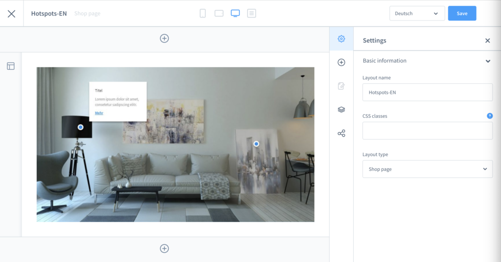
Your Interactive Hotspots layout is now ready for customization.
Add image
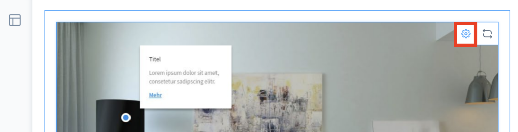
Hover the Interactive Hotspots block and click the gear icon ⚙ in the top right-hand corner to open the Element Settings window (tab Base Settings).
- To use an existing image for the interactive shopping experience, click Open Media. Select a suitable image from the Media Library.
- To upload a new image, click Upload File and locate the image you wish to use on your local machine or network.
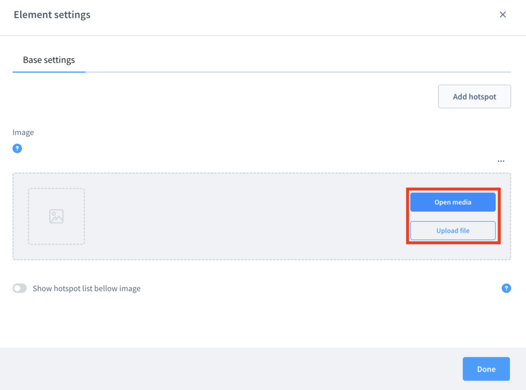
Define Base Settings
After adding an image to use for your interactive shopping experience, enable or disable the following settings as required:
- Show hotspot list below image: display a list of all hotspots under the main image.
- Scroll to list entry on click: automatically scroll down to the corresponding list entry when the user clicks a hotspot.
Add hotspot
From the Element Settings / Base Settings window, click Add Hotspot to add a new tab “Hotspot 1”. Click Add Hotspot again to add another hotspot (each numbered sequentially) until you have the required number of hotspots.
Click the corresponding hotspot tab to modify its settings, described in the following sections.
To remove a hotspot, click Remove Hotspot in the corresponding hotspot tab.
After modifying any of the following hotspot settings, click Done to close the window.
Set hotspot position
The hotspot position is the location of the clickable element that the user interacts with. By default, it is shown as a blue and white circle against your main image, however the appearance is fully customizable.
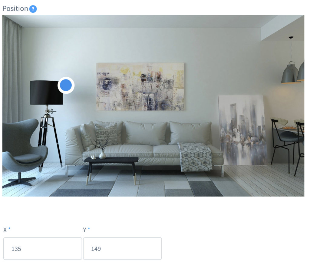
- The easiest way to set a new hotspot position is to click anywhere on the main image. The hotspot marker moves to that location.
- Alternatively, enter the X and Y coordinates for the hotspot in the two fields below the main image.
Set hotspot colors
Each hotspot marker has two colors: background (the larger outer circle) and symbol (the smaller inner circle). You can also define different colors for when the user hovers the mouse point over the hotspot, these are differentiated with the word mouseover.
To define these colors, use the corresponding color pickers or enter a hexadecimal value for each of the following fields:
- Background color
- Background color mouseover
- Symbol color
- Symbol color mouseover
Set hotspot design
There are two designs to choose from, using the dropdown menu:
- Default: the standard hotspot marker with no additional text.
- Sign: select this option to add a text label to the hotspot marker. Add any text to the field Sign Label. The text color will be the color you set as the symbol color.
Set animation styles
You can apply a different animation style to each hotspot marker to attract your customers. There are four animation styles to choose from:
- Pulse
- Heartbeat
- Energize
- Resonate
Try out each of the animations and see which ones you prefer, or use a combination of them for your hotspots.
Add overlay
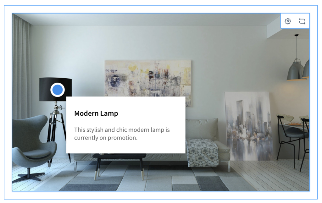
Optionally add an overlay to the hotspot which will make a text box appear when the user hovers the mouse pointer over it. The overlay can be used to further promote a product and call attention to it.
- Enable the toggle Show Overlay.
- Enter an Overlay Title and Overlay Text into the two fields below.
The entire overlay will also be a clickable link that you define in the link fields (described in the next section).
Add link
Adding a link to the hotspot allows you to direct customers to a specific product in your shop or to a specific webpage.
Follow these steps:
- For the Link Type select either External (to link to a specific webpage) or Product (to link to a specific product).
- Set the link destination when clicked. If the link is external, enter the address in the field Link URL. If the link is to a specific product, select the Product from the dropdown menu.
- Enter the Link Text.
- Set the Link Target: either Current Window or New Window (recommended, as visitors might otherwise navigate away from your shop).